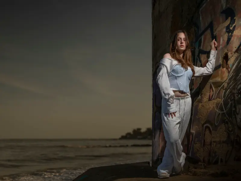
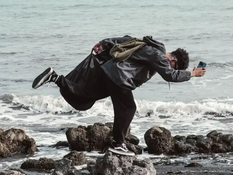
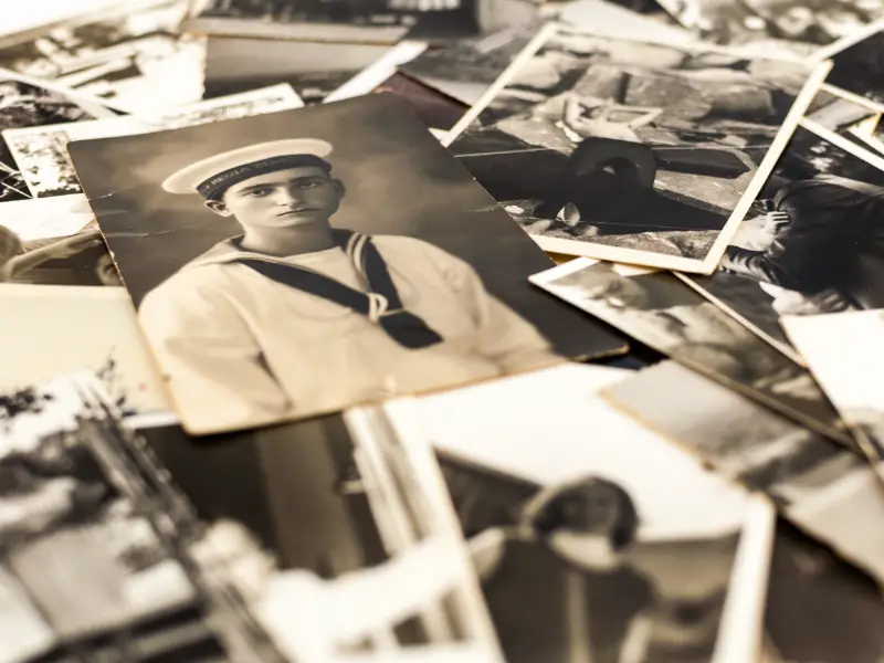
Minimalist color photography does not mean a photo has to look empty or dull. It is mainly about making more deliberate choices about what you include and exclude from the frame, giving color, shape, and light more room to breathe.
Many photos feel cluttered simply because too much is happening at once. Different colors compete for attention, details around the edges distract the eye, and subjects vie with one another. By framing more deliberately and keeping distracting elements out of the shot, you create a greater sense of calm. That does not automatically make a photo better, but it does help communicate more clearly what the image is really about.
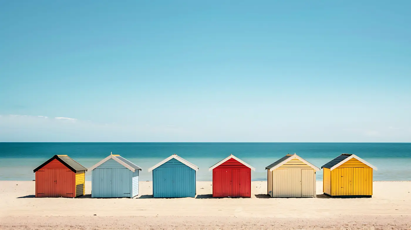
What is more, minimalist color photography does not have to be monochrome at all. Two or three blocks of color can work beautifully together, as long as they support one another. A blue facade with a red chair, a yellow jacket on a gray street, or a row of beach huts with one in a different color can be enough to make a simple composition interesting.
Not empty, but just enough
Minimalist photography often brings nearly empty images to mind: a tree in a snowy landscape, a bird against a vast sky, or a lone post beside the road. Such images fit the genre well, but minimalism is not only about emptiness. What matters much more is that everything in the frame serves a purpose.
That is why it pays to look at the less noticeable parts of the photo before pressing the shutter. A strip of sidewalk at the bottom, a traffic sign at the edge, or a second person in the background can divide the viewer's attention without you realizing it. Sometimes a small change in viewpoint is all it takes to eliminate such an element.
This makes minimalist photography primarily an exercise in selection. Rather than trying to find as few subjects as possible, decide which shapes, colors, and details genuinely add something.
Blocks of color
An enjoyable way to practice this is to stop looking for subjects right away and first look for blocks of color. A painted wall, a roller shutter, an awning, an area of shadow, or a patch of blue sky between two buildings can already provide the basis for a photograph.
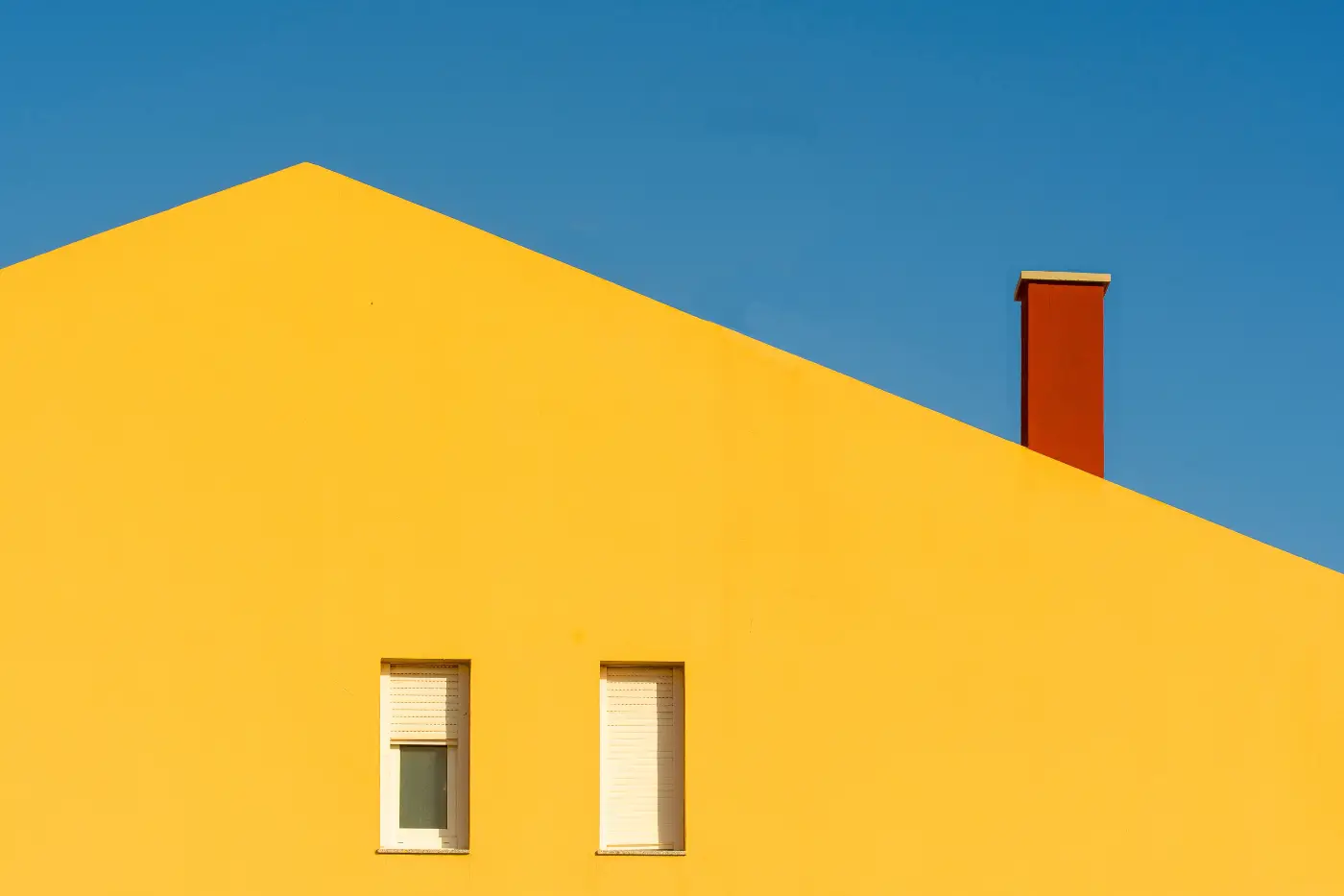
Only then should you decide whether the area needs anything else. Perhaps someone walks past wearing a color that creates an appealing contrast, a chair happens to be in exactly the right place, or the play of light and shadow creates enough tension on its own. Sometimes you may find that you do not need a subject at all and color can take center stage.
These kinds of compositions are particularly easy to find in the city. Facades, parking garages, construction hoardings, subway doors, and advertising panels often consist of simple shapes and distinct colors. Once you start paying attention to them, you will notice far more calm images than you might expect at first glance.
In Birmingham, you can find these contrasts between old brick facades, modern glass surfaces and the circular patterns of the library. A tightly framed detail can be enough to give color and shape the leading role.
One accent
A small color accent can have a surprisingly strong effect in a calm composition. A yellow raincoat on a gray street immediately draws the eye, as does a red chair against a cool-toned wall or a pink bag in an otherwise subdued image.
Because the rest of the composition is calm, such a detail carries more weight. As soon as several bright colors or striking shapes are added, that effect quickly diminishes. The image becomes less clear, and the eye no longer knows instinctively where to look.
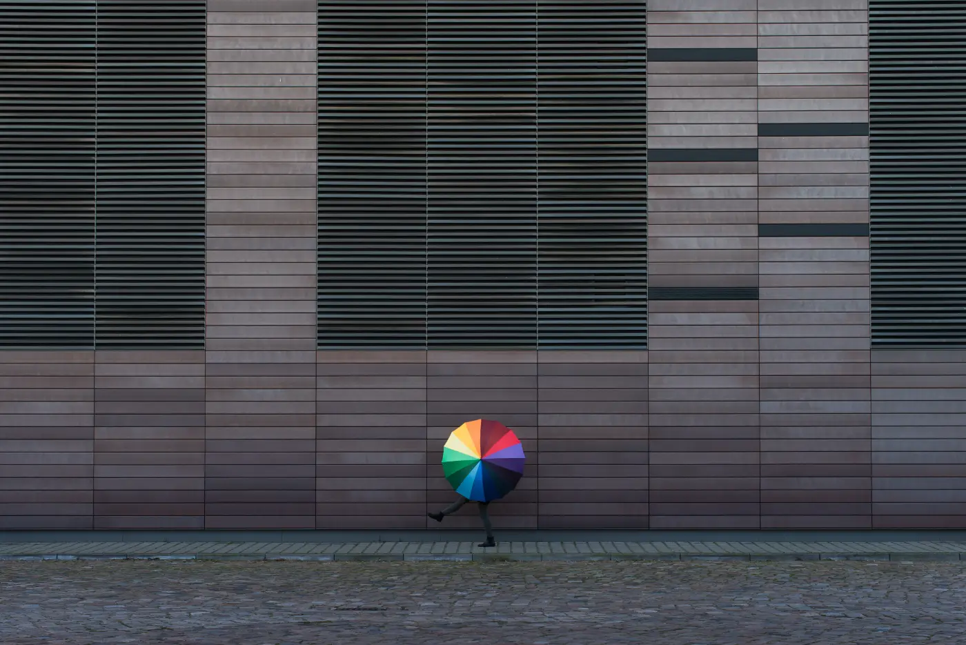
After composing the shot, it therefore helps to take one more critical look at the edges and background. If something is in the frame that does not really need to be there, it is often better to take a step to the side or wait a moment.
Light and shadow
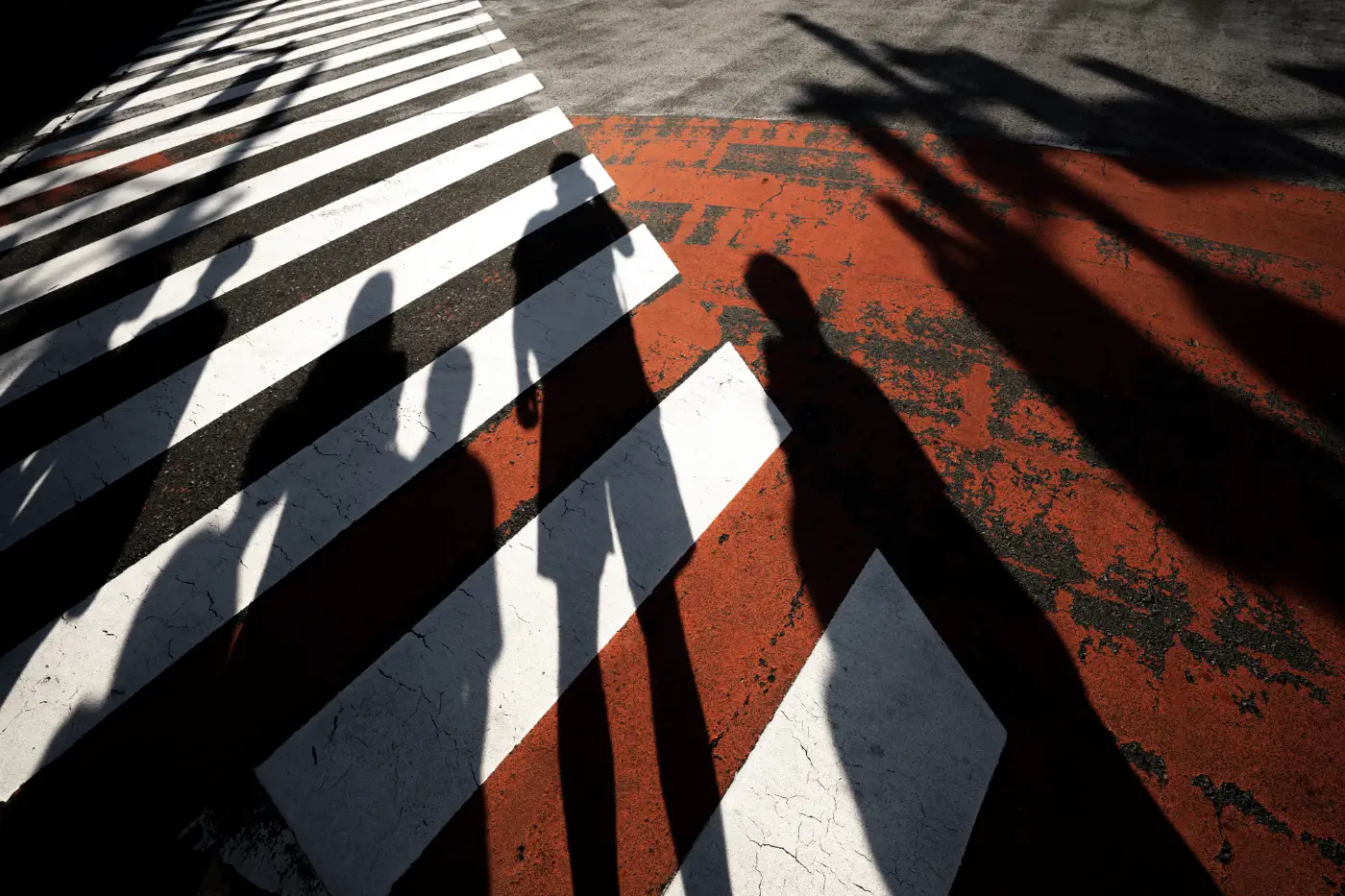
Light plays an important role in minimalist color photography because it can simplify shapes. A hard-edged shadow can divide a cluttered facade into two clear areas, for example, while a strip of sunlight can place extra emphasis on a single color or detail.
You do not have to shoot only during the golden hour. Harsh midday light can create interesting graphic shadows, while overcast light works well with soft pastel tones. Deep shadow can also be useful when it simplifies parts of the image and makes distracting details disappear.
It is therefore not only about the color itself, but also about how the light defines that color. A red wall in flat, even light may not be very exciting, while the same wall can suddenly form a clear composition when crossed by a strong shadow.
Viewpoint
In this kind of photography, your position is often more important than your equipment. Moving half a meter to the left can remove a traffic post from the frame, and shooting from a slightly lower angle can make a calm wall fill a much larger part of the image. Moving closer also automatically pushes more distracting elements outside the frame.
Minimalist compositions make small mistakes more noticeable. A line that ends awkwardly against the edge of the frame or a small part of a car in one corner can suddenly attract a great deal of attention. It is therefore wise not to focus only on the main subject, but to consciously scan the entire viewfinder before pressing the shutter.
A 35mm or 50mm equivalent works well for many photographers because it gives a fairly natural field of view. A smartphone can work just as well, however. Because it is easy to move around and quickly change your viewpoint, a phone is particularly suitable for practicing these kinds of compositions.
Keep the technique simple
Minimalist color photos do not require any special camera settings. Outdoors, f/5.6 or f/8 will often provide enough depth of field to keep blocks of color and shapes clear. If you want to separate a small detail from a calm background, a wider aperture can of course help.
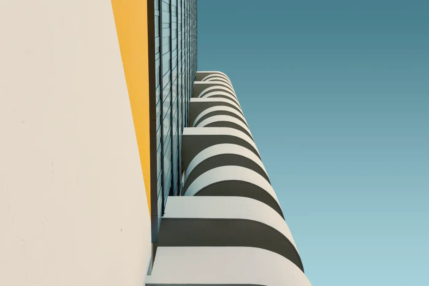
Pay particular attention to exposure. Large bright walls, the sky, or vivid colors can cause the camera to make the image too dark. A small amount of positive exposure compensation may be enough to keep the image open and bright. For dark, graphic compositions, slight underexposure can work well instead.
A grid or guide lines can also be useful. Not because every photo has to follow fixed rules of composition, but because they make it easier to see how lines, blocks of color, and small accents relate to one another.
A simple exercise
A good exercise is to deliberately take three photos during a walk in which color plays the leading role and no more than one striking detail appears. Also pay attention to how different colors reinforce one another. A few simple tips on using color in a photo composition can help you practice this very deliberately. This forces you to spend less time looking for isolated subjects and more time considering the relationship between color, shape, and space.
You will probably notice quite quickly that you start seeing differently. Instead of looking at everything that might be interesting, you focus on what you can leave out without weakening the photo. And that is exactly where minimalist photography begins: not with a special camera or complicated technique, but with looking more carefully and making more deliberate choices.