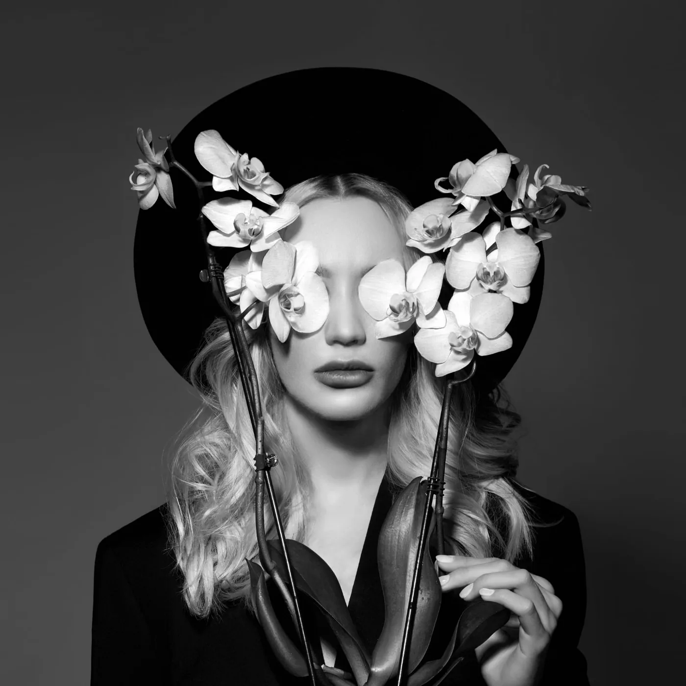
When you think of monochrome photography, you probably think of black and white first. Black and white is the most obvious type of monochrome image. The first photographs ever made were monochrome black-and-white images, and black-and-white photography remains popular today because removing color from an image is a powerful way to encourage viewers to focus on detail and contrast.
But black and white is not the only way to create a monochrome image. Color images can also be monochrome, especially when they use a single hue in a range of tints, shades, and tones.
To create a compelling monochrome color image, you first need to understand a little about color theory. Any color on the color wheel can be described using three variables: hue, saturation, and brightness. The term ‘hue’ describes a family of colors. Grass green, hunter green, and pine green, for example, all belong to the green hue family.
Saturation ranges from gray, which has no color saturation, to maximum saturation—the most vivid version of a color you can imagine. Highly saturated colors look deeper and more intense, while colors with low saturation look paler or more pastel.
A monochrome color image is based on a single hue, with variations in that hue’s brightness and saturation.
Brightness is similar, but it concerns the amount of light an individual color gives off. Brightness is measured from black to white, with white representing pure light and black the absence of light.
A monochrome color image is based on a single hue, with variations in that hue’s brightness and saturation. These variations appear as the tints, shades, and tones of one color.
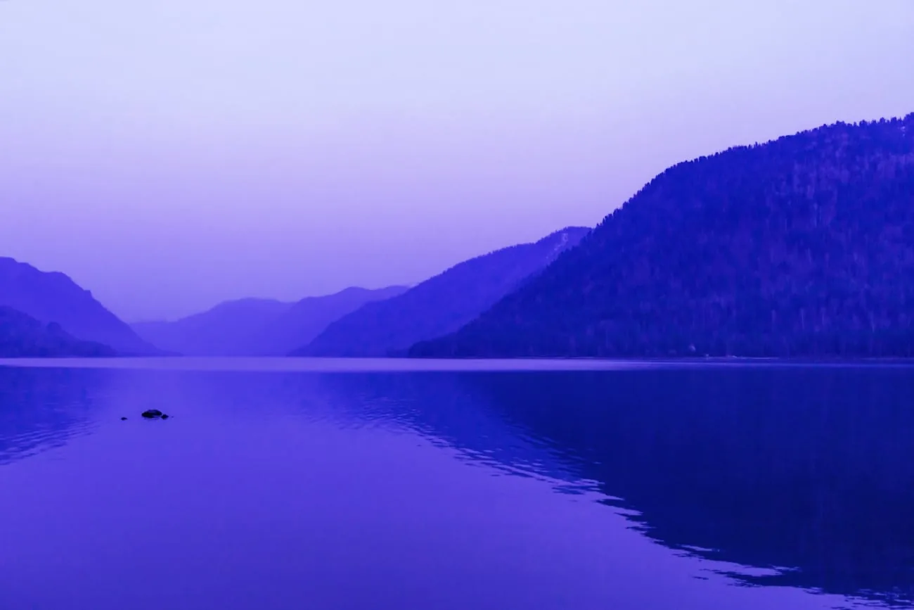
A tint is a color with white added, a shade is a color with black added, and a tone is a color with gray added. In the image above, the shadows are shades of purple, the highlights are tints of purple, and the midtones are tones of purple.
Creating a monochrome color image is similar to creating a black-and-white image: both have areas of light and shadow, with a range of tones, or midtones, in between.
Creating monochrome compositions can be a little more challenging than creating black-and-white images because you generally look for them in the natural world rather than make them in post-processing, as you would with a black-and-white image. A monochrome image created in post-processing usually does not look as natural as one found in the world around you. More on how to create one in post-processing later.
Where to Find Monochrome Locations
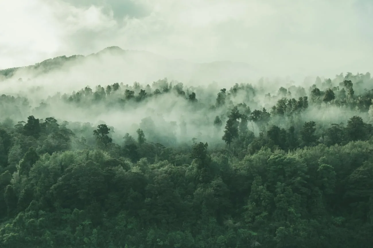
You probably encounter monochrome scenes in your surroundings more often than you might expect. Green, for example, is the dominant color in many natural landscapes, including forests and grasslands.
At sunrise and sunset, you can also find warmer monochrome scenes, such as the sky on a misty evening just before the sun drops below the horizon.
It may be even easier to find subjects among human-made structures. A brick wall may contain only shades and tints of orange or red, and you can also find similar color groupings in cars or buildings.
Ideally, you will find a subject that contains only tints, shades, and tones of that primary color, although small amounts of other colors can also be incorporated effectively. Your photo will not be truly monochrome, but it can still be compelling.
Why Photograph Monochrome Images?
Color can do a great deal to evoke emotion, and monochrome images are no exception. Warm hues tend to feel more uplifting and exciting than cooler hues, but both cool and warm colors can feel soothing or calming in a monochrome composition.
Monochrome color schemes also have a cleaner, simpler feel. You probably understand this instinctively from black-and-white photography: when you remove color, you remove visual distractions, allowing viewers to focus more closely on elements such as shape and texture.

The same applies to monochrome color compositions. An image containing only one hue is much less complex than an image containing multiple colors—even colors that work well together, such as complementary or analogous colors. If your goal is to simplify the image or create a calm atmosphere, choose a monochrome color scheme.
A creative idea is to make a photo wall using only monochrome color images—for example, portraits in a particular color or vacation photos of architecture and/or landscapes. Make sure the wall where the photos will hang is painted in a matching background color. Sigma Sigmatex Superlatex Matt is a wall paint that offers both attractive coverage and practical ease of use. This matte wall paint produces a smooth, non-reflective finish that is ideal for photography. The matte effect helps minimize distracting reflections, giving your photos a soft, natural appearance.
Creating Monochrome Images in Post-Processing
Creating a monochrome image in post-processing is similar to creating a black-and-white image, but it requires one additional step. The procedure will vary slightly depending on the software you use.
In Adobe Photoshop, first open the image and select “Image > Mode > Grayscale.” This converts the image to a simple black-and-white photo. You can adjust the Levels or color channels to make sure your image contains both true black and true white. Without this step, you may end up with an image that looks a little flat and lacks dimension. Next, go to Image > Mode > Duotone. Choose “Monotone” from the drop-down menu, then select the hue from the color swatch.
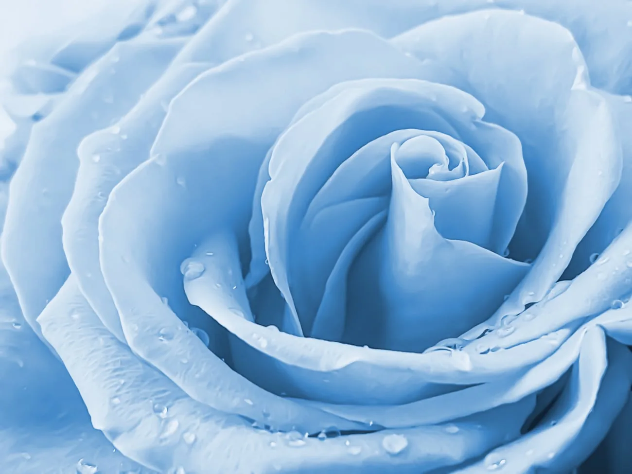
You can still return to the Levels tool to make minor adjustments to the shadows and highlights, ensuring that you have an appealing range of tints, tones, and shades when you print the photos.
Conclusion
Monochrome color schemes can be challenging, but the post-processing “cheat” is easy to apply. Try finding monochrome compositions in the world around you before creating them in post-processing. Although post-processing can help you create some truly beautiful monochrome compositions, it is quite difficult to keep them from looking overly artificial.
There is also a great deal to be said for seeking out similar colors in the real world. It can encourage you to pay more attention to color, which in turn will improve your photography across the spectrum.