Using filters to give a photo a retro, pop-art, or simply eye-catching look is popular. Successfully altering a photo so that it looks genuinely old is often not as simple as clicking a filter. Creating modern photographs that truly appear to come from another era is an art. Read on for useful tips and guidance.
The Background
The ultimate goal is to make the photo look as though it was taken in the era when the objects pictured actually existed. A photograph of an old car, for example, will not immediately make you feel that it was taken when that car was still driven through the streets every day. First, every modern element will need to be removed from the frame.
When taking the photograph, remember that old photos had a very broad depth of field. This was partly due to camera mechanics: amateur photographers did not want to fuss with odd things such as focusing, so those small instant cameras had fixed, narrow apertures that captured extremely sharp images but made the cameras nearly useless in low-light conditions.
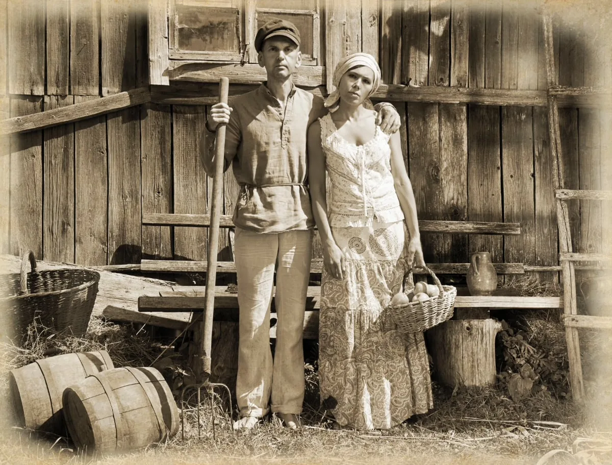
In earlier times, photographs that were sharp throughout were also much more fashionable. If your goal is to create a vintage look, try to avoid selective focus.
Professional portraits were an exception to this guideline. The art of using selective focus to separate a person from the background has a long tradition. If you want to recreate the old Hollywood portrait style, you can use a wider aperture so the background becomes slightly blurred without sacrificing the vintage look.
The Physical Print
Besides showing an object that looks as if it belongs in the past, a photograph needs other characteristics to appear old. If you plan to make a print to hang on the wall or perhaps send a smaller version to someone as a photo card, it can be fun and original to give the physical print the characteristics of an old photograph as well.

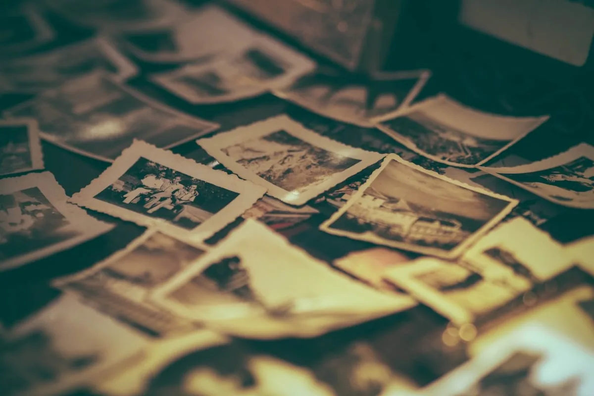
With old family photographs, for example, you can pay attention to light, tonality, color, print size, the presence of grain, and the paper. A print's condition can also say a great deal about its age: old photos may show water damage, fading, wear, or tears.
If you want to prevent that from happening to genuine old photographs, read how to store old photos and negatives properly.
Although deliberately creating the appearance of damage during post-processing may go against your instincts, remember that a damaged look can feel authentic when you are aiming for an antique appearance. Always work with a copy, and never apply these kinds of post-processing changes to an original photo file.*
Cropping
Only in modern times has the 10x15 cm ( 4x6 inch) photograph become a standard size. If you browse through old photo albums, chances are that most of the pictures are considerably smaller than today's standard prints. Until the middle of the 20th century, most photographs measured 5,7x8,25. Professionals sometimes used 16,5x21,60, but the average amateur photographer generally produced quite small prints compared with today.
If you want to create a photograph that looks as if it predates the 50s, use these old sizes, or the slightly larger but less common 8,2x10,8 format. Also pay attention to borders on 'old' prints: white borders were common, so keep that in mind when adding the finishing touches.
To imitate photographs from the second half of the 20th century, you can use a larger size, such as the 8,8x14 postcard format that was standard in the 70s and 80s.
Color
It is tempting to simply use your software's built-in sepia function during post-processing to obtain an old look. Many old photographs, however, do not look like that at all. They may have a pale blue tint or be fairly neutral, like a modern black-and-white photograph. That does not mean you should never use sepia, but it is important to know which eras produced photographs with light-brown tones and when images looked neutral or leaned toward blue.
All photo-editing software now offers a sepia color option. Alternatively, you can simply desaturate the image and then add a little red or yellow until the result begins to resemble an old photograph.
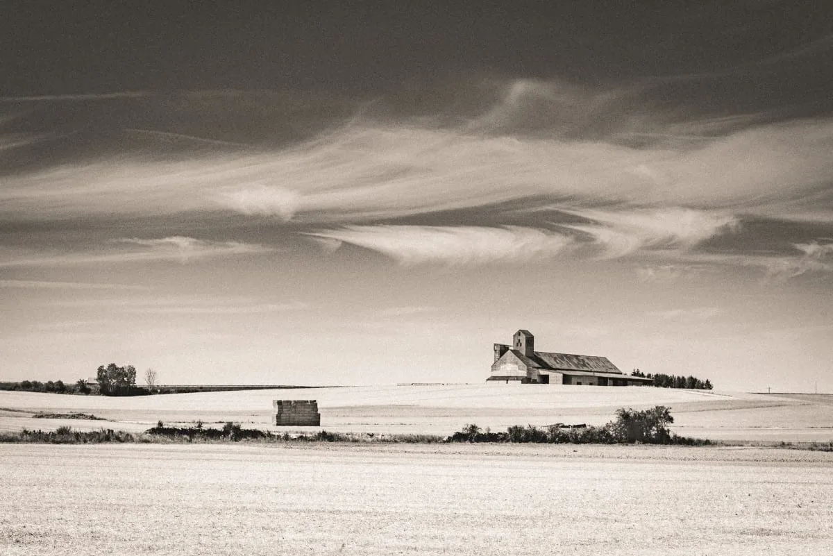
It helps to have a photograph from the era you want to emulate on hand so you can match its color. Note how much red or yellow appears in the image, then make adjustments until the result looks reasonably convincing. Remember that your monitor must be calibrated correctly for precision. Otherwise, the image may look very different on paper than it does on the screen.
Photographs from later eras, when color photography became popular, are also easy to recreate. Old photographs from these periods tended to fade or suffer some color degradation, mainly because they were stored in unsuitable albums, frames, and boxes.
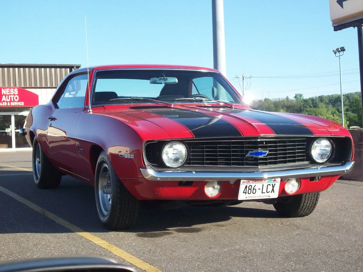
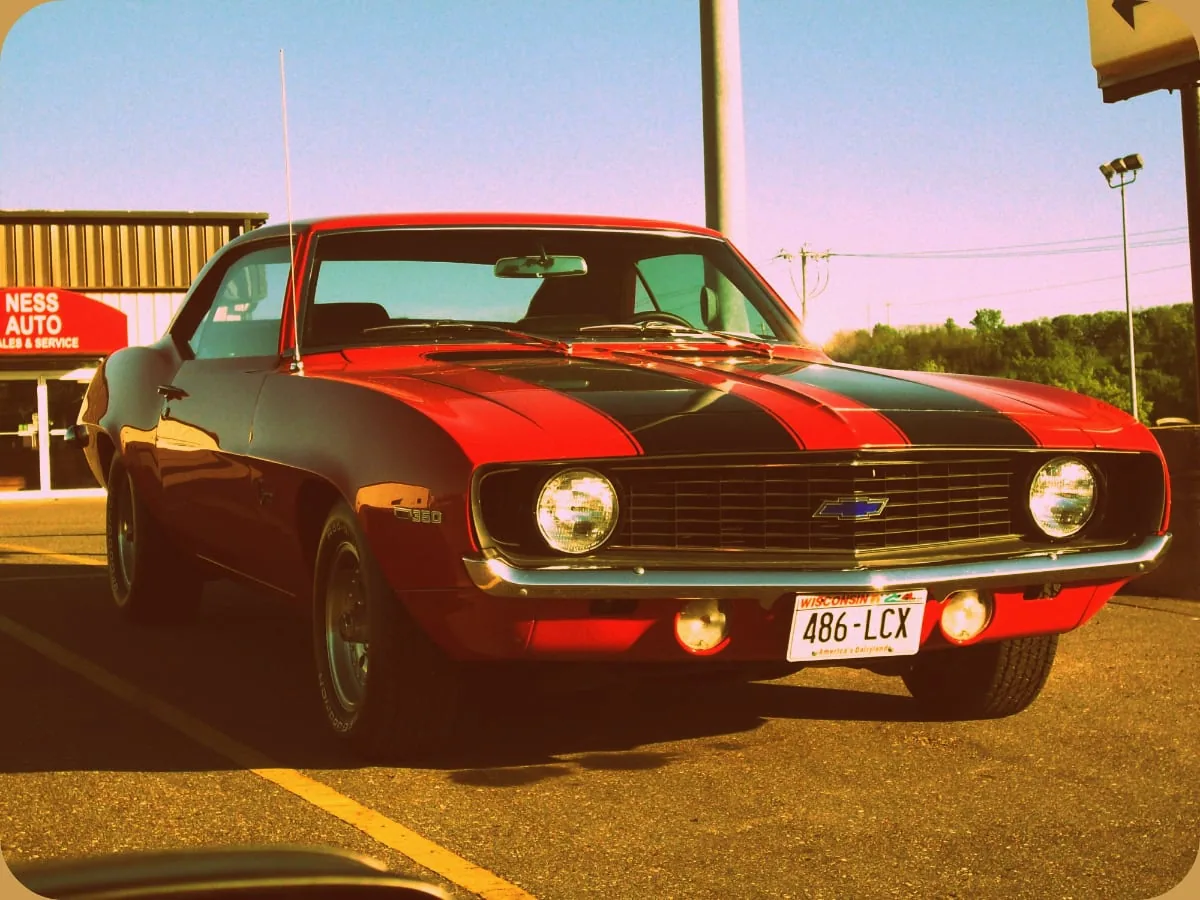
That fading or discoloration gives them their distinctive vintage look. Another difference is that those older color photographs were not as saturated as modern images. During post-processing, you can sometimes reduce the saturation slightly and then increase the contrast to simulate that 'old photo' look.
There are also many downloadable presets that can be added to image-editing software, such as Typical 60's, Fugi Film or 1970. If the photograph was taken with a smartphone, it is even easier: you can download any number of apps that quickly simulate the appearance of photos from particular eras. For some people, that may be easier than manually changing saturation and contrast during post-processing.
Tone
Old black-and-white photographs were often underexposed. You can imitate that look by adjusting the levels, darkening the shadows, and muting the highlights. Outdoor photographs generally had better exposure, but their contrast was sometimes too extreme.
Try adjusting the midtone slider with the Levels tool while leaving the highlights and shadows alone. If you are aiming for the look of an ordinary snapshot, try creating an image with lower contrast. Use the contrast tool to make the blacks and whites slightly grayer.
Grain
Although we prefer to avoid noise in the photographs we take, its film equivalent—grain—was much more common in the past. If you shoot an image with vintage processing in mind and there is little light, you may want to add some artificial grain during post-processing to make it look like a film photograph.
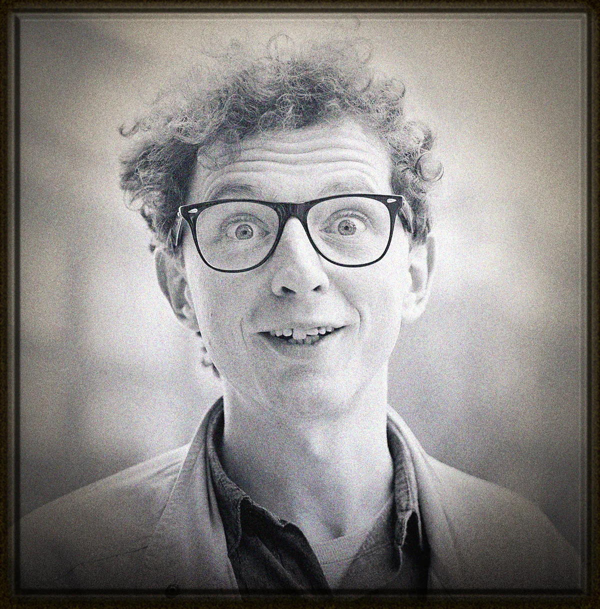
It is important to remember that grain looks different from digital noise, so simply raising your ISO is not the right way to simulate it. Digital noise often appears as an increase in the number of visible pixels, whereas grain grows in size, not in number, as the ISO increases. Graininess is therefore a look you should add during post-processing.
*Creating artificial scratches or water damage is a more advanced technique that this tutorial does not cover further. If you have made a copy, however, you can experiment with it. Challenge yourself to match the look and feel of a photograph found in an old family album, then mail a few prints to see whether your friends and family can tell that they are not genuinely old images.
© Produced in collaboration with / thanks to David Peterson - Fotografie.nl
Read this article in Dutch: Nieuwe foto's een vintage look geven.