The rules of photography are really only guidelines. Breaking the rule of thirds, for example, does not necessarily produce a poor result. Like all the other rules, the rule of thirds simply gives you an idea of how to compose a photograph. No law says you have to use it. These rules exist, however, because they usually work.
So when you photograph the world around you, how can you know which—if any—of the many rules of composition to apply? The more you shoot, the more intuitive this becomes. This article offers a brief overview of the compositional rules that work best in most situations.
The Rule of Thirds
The oldest and best-known rule in photography is the rule of thirds, which has existed for centuries. Its origins can be traced to artists of the Renaissance, who began to wonder why a particular painting could command attention and invite the eye to wander through the image. Renaissance painters discovered that the eye does not rest at the center of a painting. Instead, it wants to move toward the subject.

The rule of thirds is simple. Divide the frame into nine equal sections, then place your subject at one of the intersections or along one of the vertical or horizontal lines.
Why does this work? The answer is quite simple. When you place an object in the center of the frame, the eye goes there and stays there. Because the object is centered, the eye has no reason to move and explore the rest of the image. The photograph is static. Place the object in the left or right portion of the frame, however, and everything changes.
An image divided into thirds feels more dynamic because the eye moves to the subject and is then encouraged to travel across the frame. Rule-of-thirds images are dynamic. They have movement, even though it is not the kind of movement you can literally see.

You can improve almost any photographic composition by dividing it according to the rule of thirds. It is the most straightforward way to create a strong photograph. There are certainly cases in which ignoring the rule produces a better image—for example, when your subject has strong symmetry.
A building or other subject that looks the same on the left as it does on the right will generally feel more balanced when centered in the frame rather than composed according to the rule of thirds.

Usually. Every rule has exceptions, and even the exceptions have exceptions, so use your own artistic judgment.
Using Lines
One of photography’s greatest challenges is that it is a two-dimensional medium. Every photographer must persuade the viewer that the two-dimensional image before them exists in three dimensions. It is an illusion, of course, but depth makes an image more interesting.
The first and probably most successful technique is the use of leading lines. When the eye encounters a line in a photograph, it naturally follows that line toward its point of origin or vanishing point. That is why images of railroad tracks, for example, can look so three-dimensional: our brains understand that those converging lines exist in three-dimensional space.

Lines can be used in other ways as well. A curved line, for example, can also add a sense of dimension to a photograph. Imagine a road winding along the sides of a hill and eventually disappearing into the distance. Your eye uses that road to interpret the scale and depth of the scene, while its gentle curves also have a calming effect.
Lines work in almost every kind of photograph, from landscapes to portraits. They are naturally less necessary when the subject fills the frame, but in some images they can create a real sense of depth.
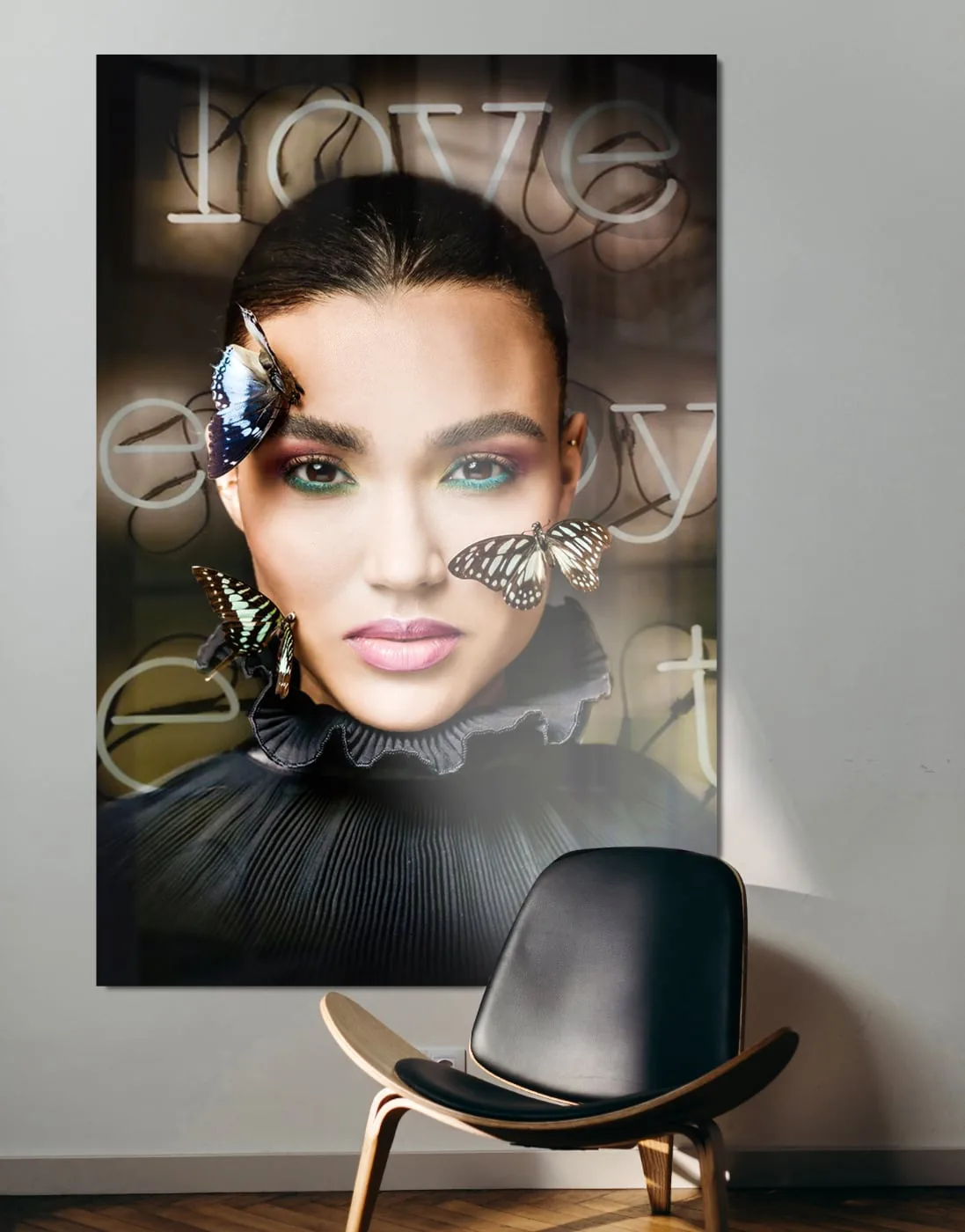
A straight-on portrait of a girl may feel very static, but if she wears a collar with lines in it, you gain a stronger sense that she truly exists in a tangible place and moment.
Move Closer
We live in a highly complex world. Even the natural world outdoors is busy. Landscapes are filled with trees, shrubs, birds and insects, soil, water, air, and clouds—it is all visually dense. The best images do not contain a little of everything; they contain a little of something.
When a photograph contains too many things to look at and has no focal point, the image feels disjointed. No image should contain too much information. If your composition contains many different elements, the result is chaotic. The viewer does not know where to look and may not spend much time with the image. In this situation, it can be best to disregard the rule of thirds and, for example, zoom in on a centered subject.

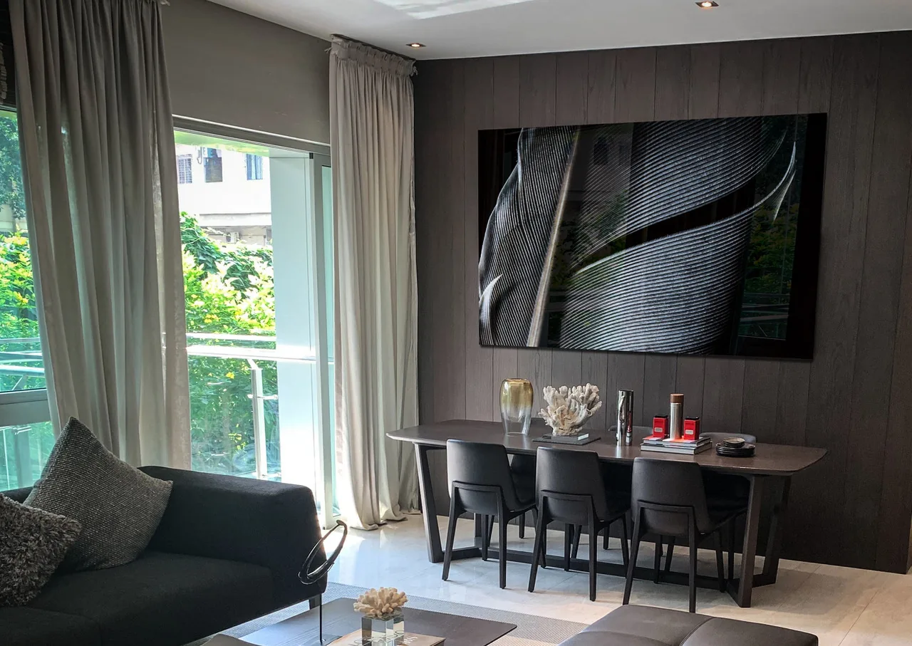
In the photograph above, shown as an acrylic-glass print, the composition zooms in on the center of the subject. This gives it a powerful presence even though the rule of thirds has been set aside entirely.
Whenever you pick up your camera, first spend some time considering the simplest way to compose the image. Can you leave out objects that contribute nothing to the composition? Can you use a wider aperture to blur distracting background elements? Or can you zoom in farther?
Anything you can do to simplify a compositionwill produce a stronger result. The key is to identify the important elements and leave everything else out. You will usually find that an image contains only a few important elements—perhaps even just one.
Conclusion
No compositional “rule” is right for every situation. These three rules can improve your photographs quite consistently, however, so keep them in mind whenever you pick up your camera.