Autumn is one of the best times of year to take photographs. At no other time of year does nature offer such a magnificent array of vibrant colors. Spring certainly comes close, but even then, those sparkling colors are simply not as abundant as they are in autumn, when every deciduous tree and the ground beneath it is filled with yellow, orange, and red.
But are you unhappy with your autumn foliage photos? Have you ever come home, opened the photos on your computer, and found that the colors were not quite as you remembered them?
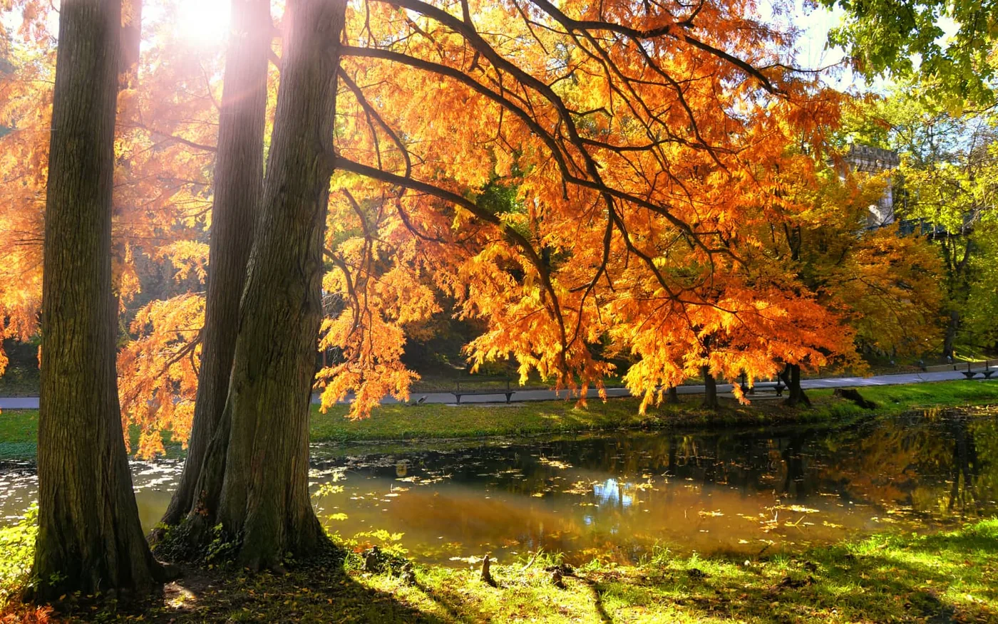
Unfortunately, even modern digital cameras are not always able to reproduce those brilliant colors accurately. You may have set everything up correctly and captured the perfect composition and focus, only to find the colors rather disappointing. The good news is that, once you are somewhat familiar with post-processing, it is fairly easy to enhance those colors afterward. Read on to learn how.
What you can do beforehand
There are plenty of things you can do to capture the best possible photo before moving on to post-processing. Remember that the best color range is achieved by shooting at a low ISO, because lower ISO settings reproduce subtle differences between tones more effectively.
Shooting in RAW, if your camera offers that option, is also a very good idea. Shooting in JPEG produces an 8-bit image, while RAW produces a 12- or 14-bit image. This generally gives you more color tones when shooting in RAW, bringing the colors in a photo much closer to reality.
Cloudy days can also be good for photographing autumn colors...
Also make sure you go out at the right time of day. Colors generally become richer and more beautiful when photographed at the beginning or end of the day, during the golden hour. An hour after sunrise and an hour before sunset are the best times to capture autumn colors because the light is softer and more even.
And the color of the light during the golden hour is naturally warm, which can also help complement those warm autumn colors. Photographing in the afternoon can cause details to disappear in the bright, direct light and produce black shadows and highlights that generally result in very poor color rendition.
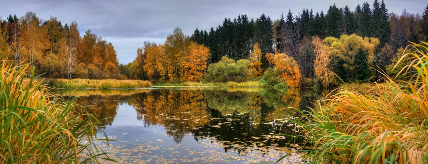
Cloudy days can also be good for photographing autumn colors; lighter colors may be muted by the filtered sunlight, but bright colors can look even more vibrant on a cloudy day.
Bringing out colors in post-processing
Once you have taken the photo, you can use the following post-processing steps to make the colors even more beautiful.
For this tutorial, we use Photoshop. Bear in mind that different versions of Photoshop, and related programs such as Photoshop Elements, have different menu options and procedures for making adjustments, so you may need to adapt the steps slightly depending on the software and version you use.
- The first step, of course, is to open the photo. Make sure the Layers panel is visible on the right side of the screen; if it is not, go to Window > Layers to enable it. Now click the small half-black, half-white circle at the bottom of the Layers panel to add an adjustment layer. Select ‘Curves’ from the menu.
- In the pop-up window, find the drop-down menu labeled ‘Curves.’ Select ‘Increase Contrast’ from the drop-down menu. This will probably produce a fairly dramatic result. Do not worry if it looks excessive; we are not finished yet...
- Close the window and return to the Layers panel. Make sure the adjustment layer is selected and change its opacity. The amount will depend on how strong you want the increase in contrast to be. Usually, no more than 25 to 35 percent is needed, but judge for yourself.
In most cases, your photo will contain more than just autumn leaves. It will also include other elements, such as the branches of trees or paths through the forest. Our goal is to adjust only the leaves themselves, which means masking everything you do not want to change.
- To do this, click the mask thumbnail in the Layers panel—the large white square that appears on the adjustment layer you just created. Now select the Brush tool from the toolbar on the left side of the window. Make sure your foreground color is set to pure black: find the two overlapping squares near the bottom of the toolbar on the left side of the screen, then look just above them for the smaller pair of overlapping squares. You can click the double arrow beside those smaller squares to switch between a black foreground and a white foreground.
- Once you have set the foreground color to black, paint over every area of the photo that you do NOT want to change when adjusting the foliage, such as paths, tree branches, bodies of water, and so on. Note that no black appears on the image itself. Instead, the contrast you added in the previous step disappears from the areas you paint over. Look at the mask thumbnail to see the mask itself; as you paint, black appears only there. You do not need to be perfectly precise. If you miss a few leaf tips or overlap an area slightly, it will not be particularly noticeable in the final image.
- Suppose you want to add color rather than contrast alone. Select the foliage, which is easy because you have already masked everything that is not foliage. Hold down the CTRL key (on a Mac) and click the mask thumbnail. You will now see ‘marching ants’ around the foliage, or around everything you painted outside the mask.
- Now add another adjustment layer. Click the half-black, half-white circle again and select ‘Hue/Saturation.’ This is where the magic happens... Experiment with all three sliders—Hue, Saturation, and Lightness—to alter the foliage.
- Move the ‘Hue’ slider to change the colors themselves. Move the ‘Saturation’ slider to change the richness or depth of those colors. Move the ‘Lightness’ slider to make the colors darker or lighter. How you move the sliders is entirely up to you. You can simply increase the saturation of the existing colors or change them completely. This technique can even turn green foliage into autumn foliage: move the ‘Hue’ slider toward the red and orange range.
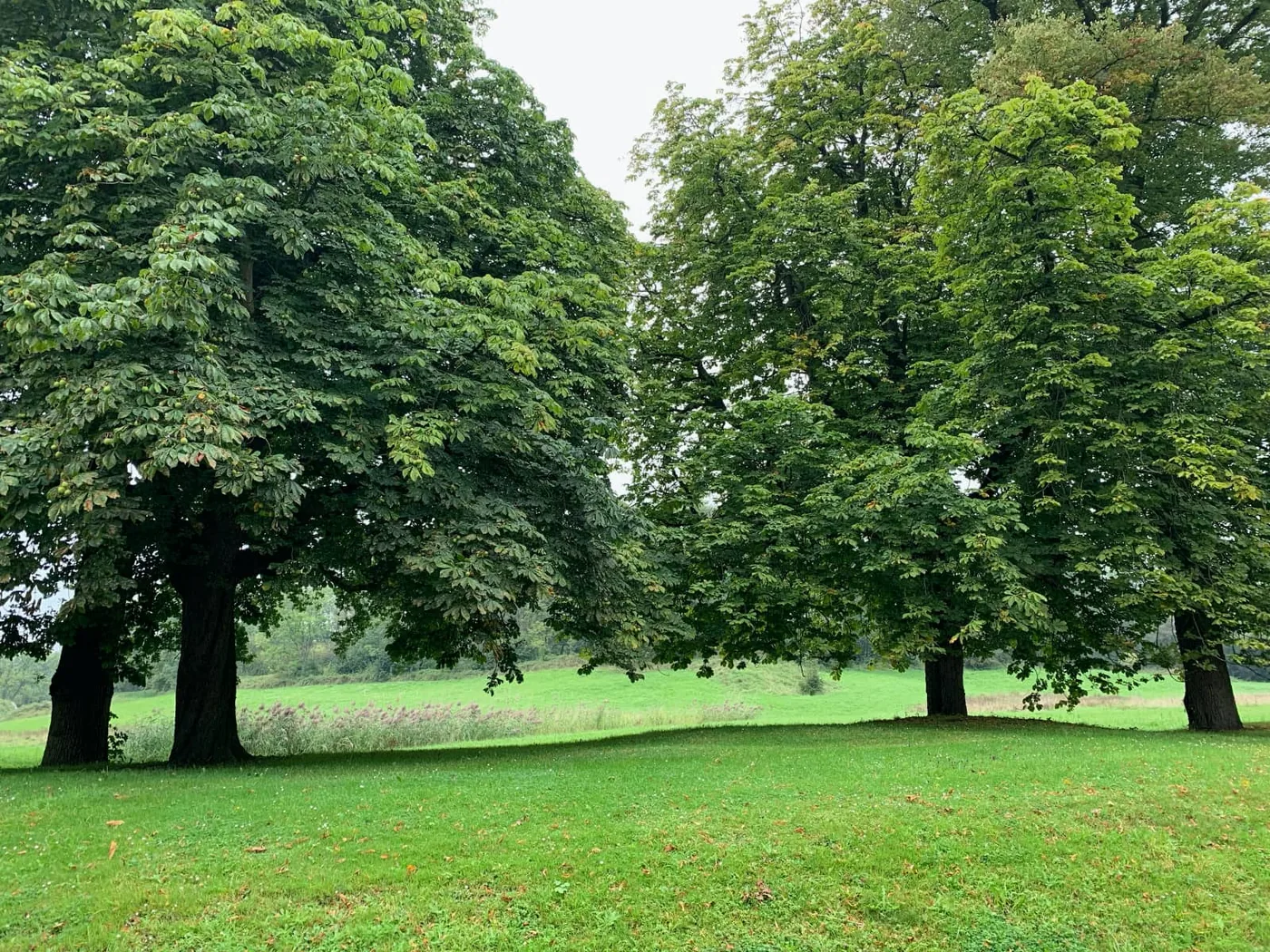
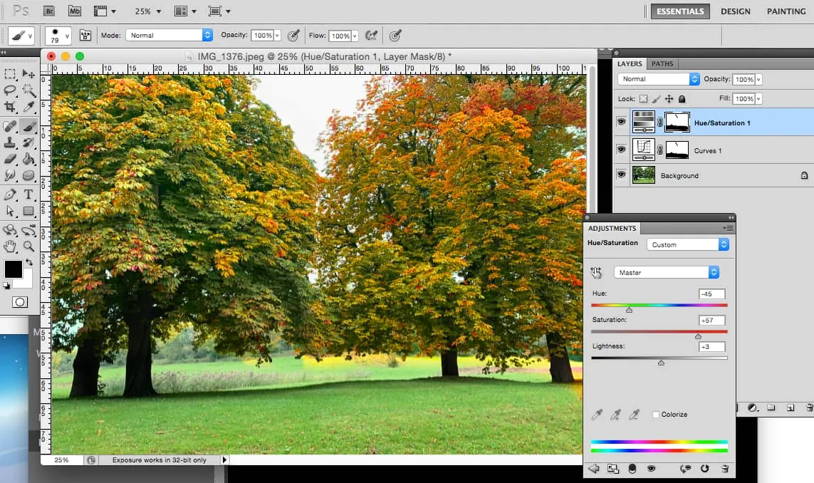
Do not overdo it. It is easy to get carried away with this technique once you discover how much control you have over all those amazing colors. Try to edit the colors so that they still look natural. Too much saturation can also destroy detail, so it is best to stop before anyone begins to suspect that you have made adjustments.
To see what is really happening to the colors as you make your adjustments, view the image at the pixel level. Zoom in to a magnification of at least one hundred percent. Then watch the details as you move the sliders back and forth: if they become muddy or start to merge, you have gone too far.
Conclusion
For people who are not accustomed to post-processing, this will not be as simple as making a basic adjustment, but once you become familiar with these steps, they are quite easy to apply. The results are impressive, so mastering the process is almost certainly worth the small additional effort.
The best part is that you no longer need to be disappointed by the colors in your autumn foliage photos. They can all be improved, and you may find yourself revisiting some of your older autumn photos to make the same adjustments. Once your autumn photos truly resemble the season as you see it in your own area, you will almost certainly look forward eagerly to this time of year and everything it has to offer.