Why does one photo stand out while another feels ordinary? Contrast is often the key. Contrast occurs when you place two opposites next to each other, and it can draw attention to an important element in a photo. Contrast takes many forms. This article explores several ways to use it to create distinctive images.
What Is Contrast?
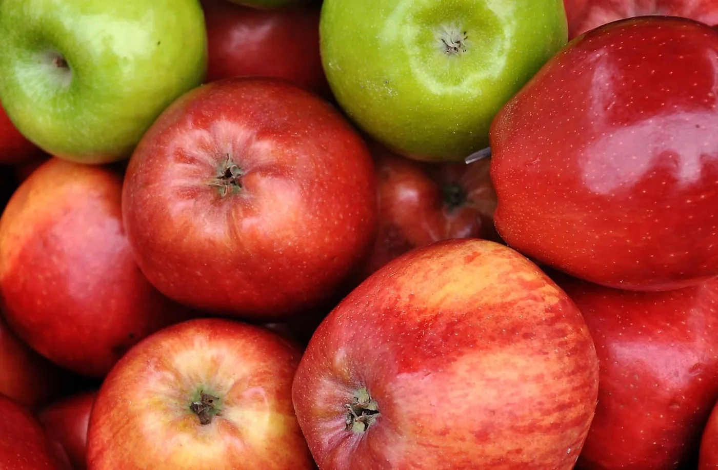
First, compare the following images. In the first one, the green apples stand out clearly against the red color of most of the other apples. Their different color creates contrast with everything around them.
The next image shows many green apples. They are all brightly colored, but none is especially distinctive or interesting. The only differences are their size and the sharpness of their details; otherwise, they all look alike.
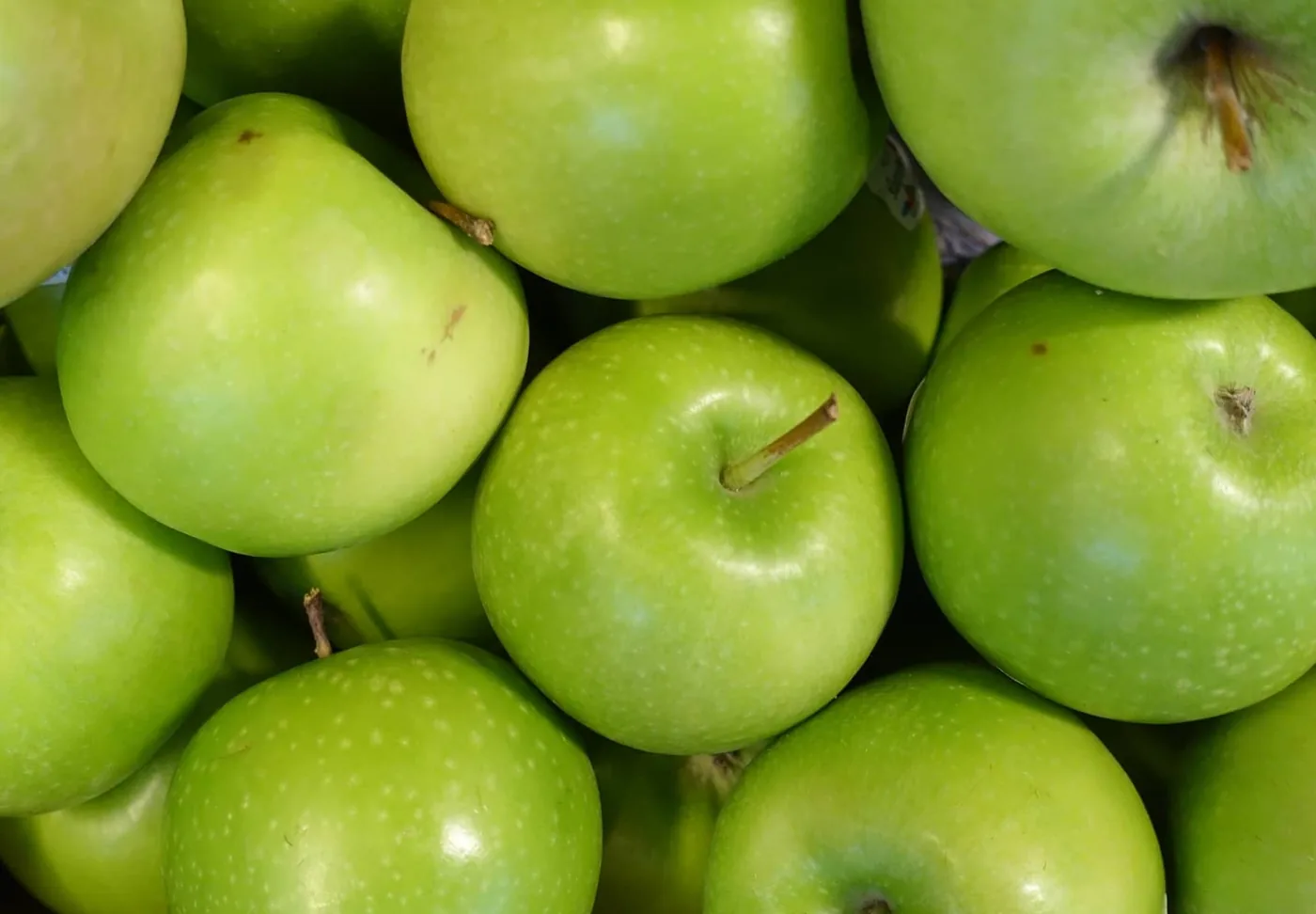
This example shows that contrast is not about the things you photograph but how you use them in the frame. Where do you place elements so they stand out? What else have you included? Creating contrast involves more than simply putting something colorful in an image. You need to carefully balance the object and everything around it to make an interesting photo.
Contrast with Color
Color is one of the easiest and most accessible ways to create contrast. Using very different colors in one image can draw attention to your subject. Some photographers do this in post-production. You have probably seen black-and-white images with a subject, or part of one, shown in color—images like this:
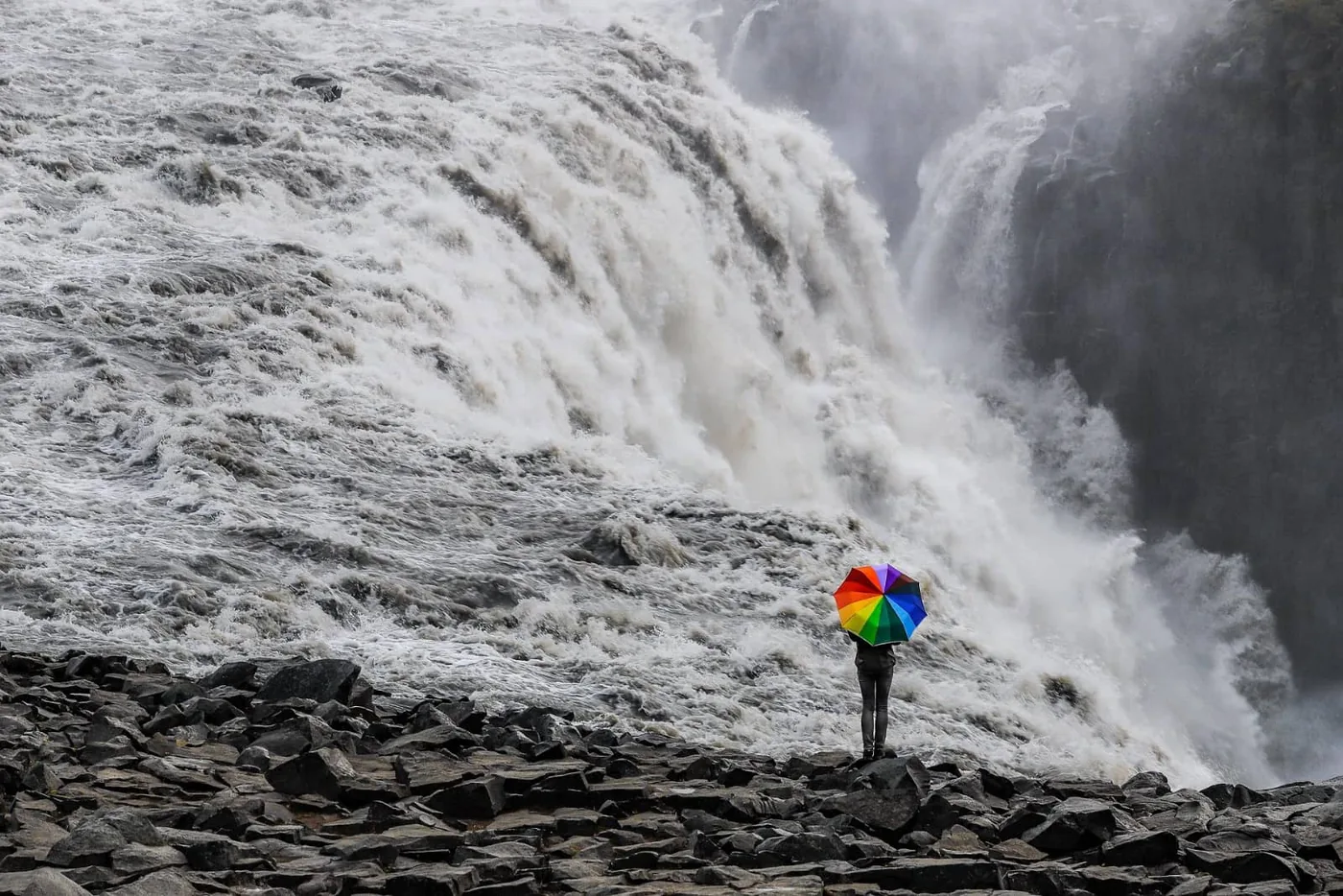
The example with the green and red apples works similarly. Because the green apples are in the minority, they naturally stand out.
To add color contrast, identify the colors in the scene, determine what is missing, and then find something that fills that gap.
In most cases, this means finding a scene with relatively few colors. Many photos contain so many competing colors that they become distracting. In a studio, you can easily remove elements that do not suit your subject. Outdoors, you may need to choose a different background.
Contrast with Focus
Depth of field and focus also affect contrast. If your subject is the only sharp element in the frame, it will contrast strongly with everything that is blurred, as in this photo:
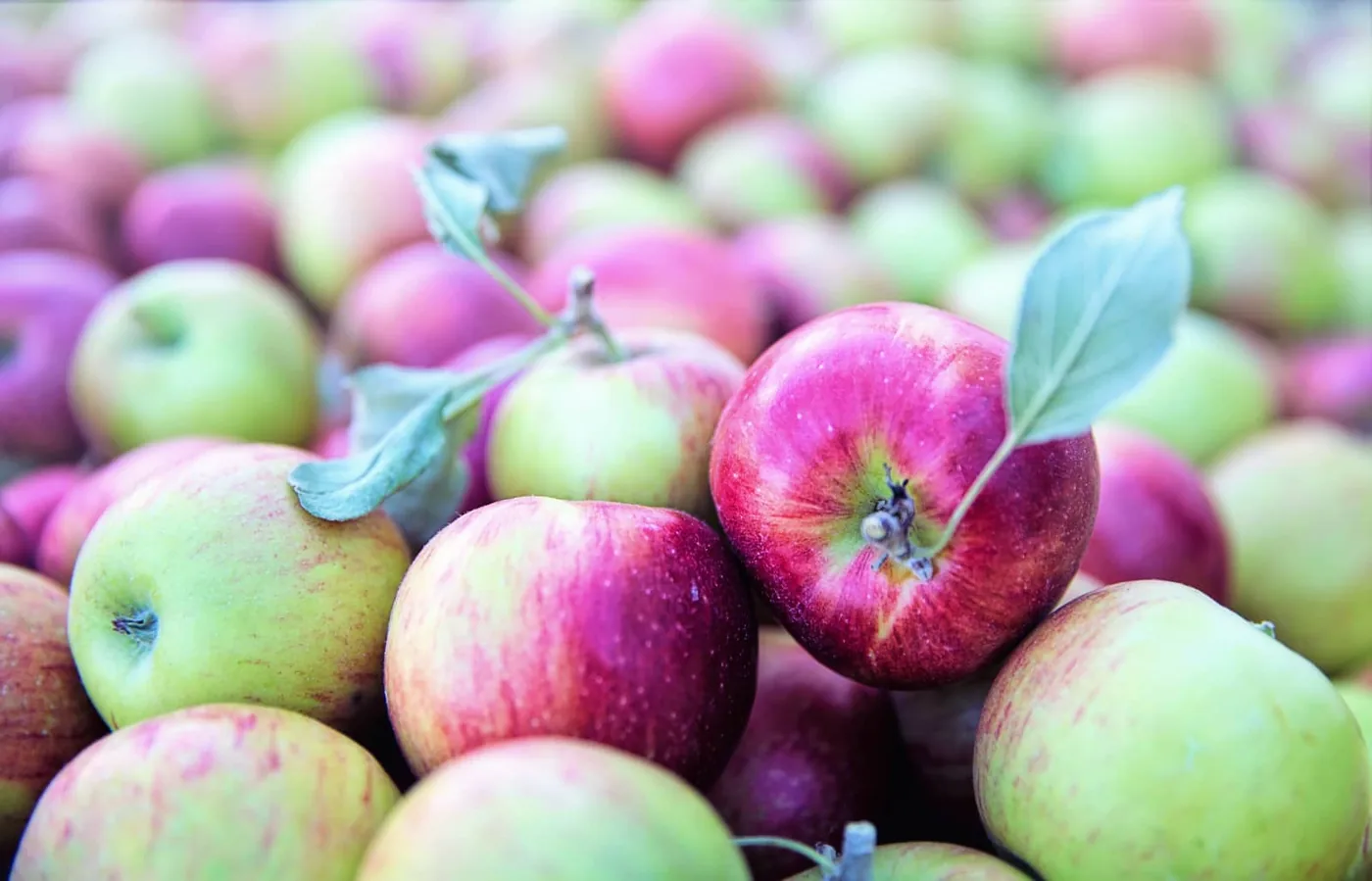
To blur the rest of the image, simply choose a wider aperture. At F2.8 or F4, most of the image will usually be blurred except the area in focus. Be especially precise when focusing on small subjects. Manual focus may work better than autofocus.
Contrast with Composition
Where you place your subject also matters. The rule of thirds can create additional contrast between the subject and the rest of the image. According to this guideline, the subject should be positioned one-third of the way into the frame from the top, bottom, left, or right. Any of those positions can draw attention to the subject.
Look at the two green apples among the red ones. The green apples were not only in the minority; the photographer also placed them one-third of the way into the frame. That was no accident. The rule of thirds makes the green apples stand out even more.
Contrast with Theme
Contrast is not always about color, focus, or composition. You can also use themes within a photo. If everyone is looking right, the person looking left naturally stands out. The same applies when everyone is enjoying themselves except for one person who looks sad.
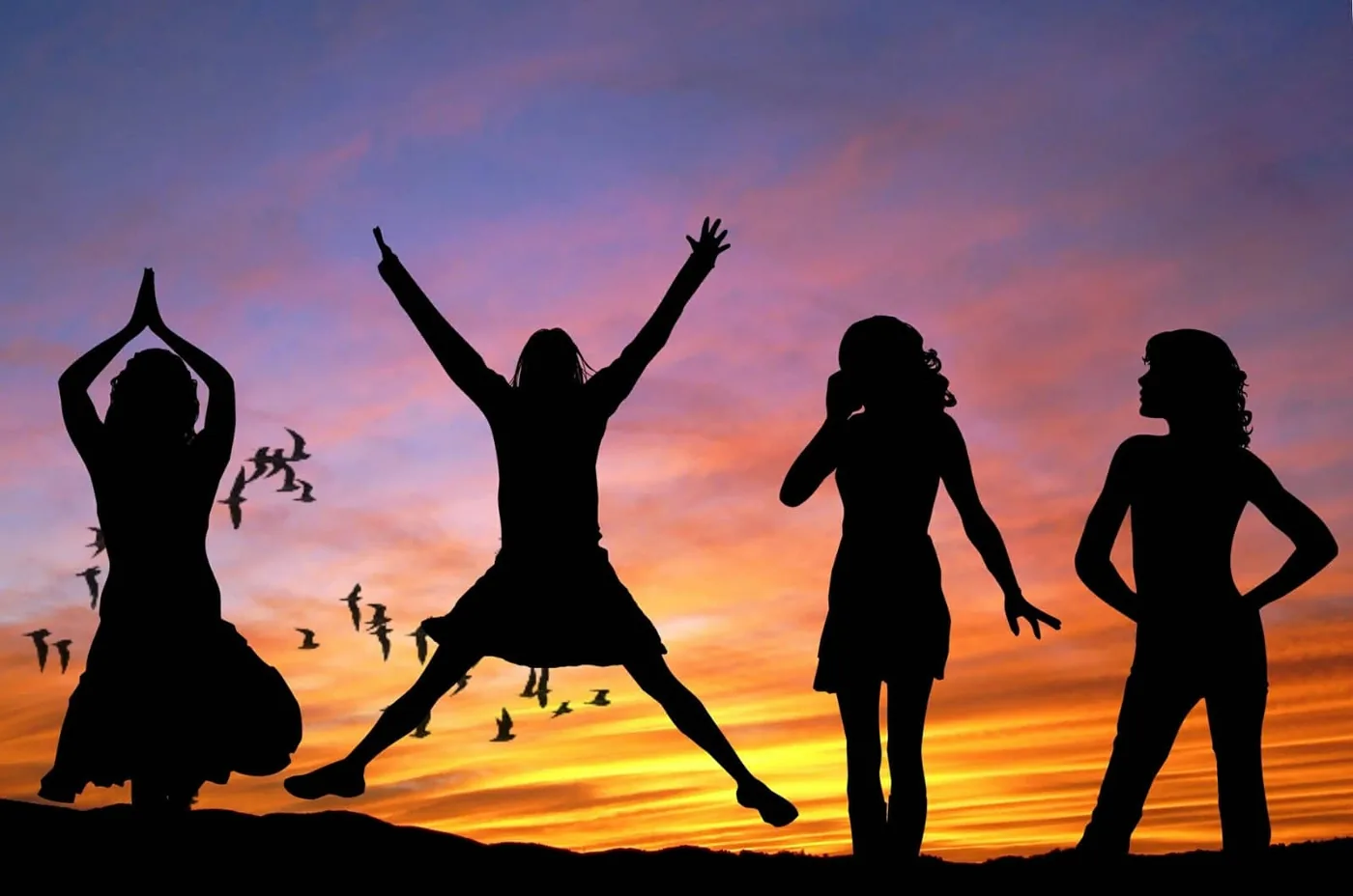
In the example above, one person is airborne while everyone else is still standing. We tend to think of contrast as limited to colors and shapes, but an underlying theme always connects the elements. Sometimes that contrast is emotional.
Conclusion
People who like high-contrast images do not mean every part of the image. An entire image cannot contrast with itself. To create contrast, think about the one element you want viewers to notice. Whether you use color, focus, composition , or thematic contrast, the result can be compelling.