I always begin every edit with white balance. When the white balance is right, the color is right, and color-correction problems almost disappear on their own. You adjust white balance in the Basic panel—the least aptly named panel in Lightroom. It should have been called ‘Important,’ because it contains the most important controls in the entire Develop module.
Step One:
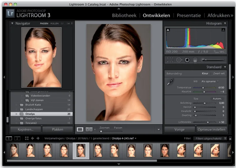
In the Library module, click the photo you want to edit, then press D to switch to the Develop module. Since develop starts with D, the choice makes sense.
You may now be wondering which key opens the Print module. Do not bother trying to make sense of it. That would make everything far too logical. No, only the Develop module uses the first letter of its English name. (Waaah!)
Anyway, once you are in the Develop module, you will find all the editing controls in the panels on the right. The photo appears with the digital camera's white-balance setting, called As Shot.
Step Two:
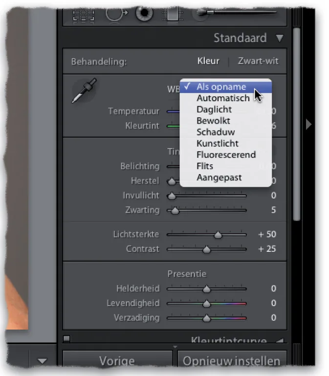
At the top of the Basic panel are the white-balance controls. The White Balance (WB) drop-down menu contains the same white-balance settings as your camera (see image).
Note: The major difference between processing JPEG and TIFF photos and processing photos shot in Raw is that only Raw images display a full list of presets. If you shot JPEG, you get just one choice: Auto. That is it.
Step Three:
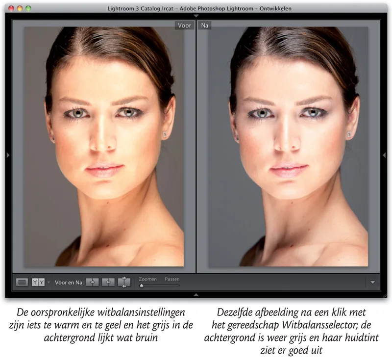
In the photo from step one, the skin is slightly yellowish and the image as a whole looks a little too warm. The white balance definitely needs to be adjusted. (Note: To follow these steps, download this photo from www.kelbytraining.com/books/LR3.)

Choose Auto from the White Balance drop-down menu and look at the result. The skin already looks better, but the gray background is blue, the highlights in her hair are blue, and although her skin is better, it still looks a little... bluish.
The next three white-balance presets are warmer (more yellow). Daylight is slightly warmer, Cloudy is warmer still, and Shade is much warmer. Choose Cloudy, for example, and the photo immediately looks too warm.

Step Four:
If you choose either of the next two presets, Tungsten or Fluorescent, everything turns absurdly blue. So skip those. Choose Flash instead (see image). Although it is not perfect, it at least looks decent. (Try each setting in turn to see its effect on the photo.)
The final preset is not really a preset. Custom means that you adjust white balance manually using the two sliders below the drop-down menu.
Now that you know what the options do, here is my advice: quickly run through these presets first and see whether one happens to be exactly right. (That happens more often than you might think.) If none is perfect, choose the preset that comes closest. (In this example, that was Flash, which is not as warm or bluish as the others. I do think the gray background now looks slightly brown, though.)

Step Five:
Now that you have a preset that is heading in the right direction, refine the white balance using the Temperature and Tint sliders. The image shows a close-up of both sliders in the Basic panel. I want to show how brilliantly Adobe helps you here: the colors in the sliders indicate what happens when you drag in a particular direction.
Do you see that the left side of the Temperature slider is blue and gradually turns yellow toward the right? That tells you exactly what the slider does. All right, without any further explanation: which way would you drag the Temperature slider to make the photo bluer? To the left, of course. And which way would you drag the Tint slider to make the photo more magenta? See? It may not look like much, but it is a great help.
Step Six:
After selecting the Flash preset, you may find the background too brownish (too warm). Slowly drag the Temperature slider to the left, toward blue, until the brown disappears and the background is gray again. (Do not drag too far left, of course, or it will turn blue.) In the example, I started with a color temperature of 5500. When I finished, it was 5023 (see step five). That is all there is to it.
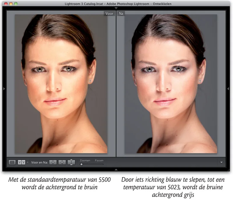
Use a white-balance preset as your starting point and adjust it with the Temperature slider until it looks right. If the photo now looks too magenta, drag the Tint slider away from magenta and toward green. (Again, move it slowly and not too far.)
Step Seven:
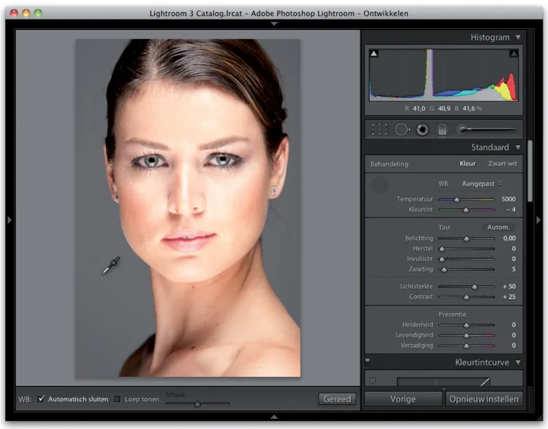
Now that you know these two methods—the preset by itself and the preset refined with the Temperature and Tint sliders—I want to introduce my favorite approach. The White Balance Selector tool usually gives the best result. (It is that enormous eyedropper on the left side of the panel.)
First choose As Shot from the White Balance drop-down menu so we can start with a clean slate. Select the tool by clicking it, then click something light gray in the photo.
(Yes: find something gray; do not click something white. Unlike video cameras, digital still cameras base white balance not on pure white but on light gray.) In the example, I clicked the background once. That single click with the tool set the correct white balance. (Temperature is now 5000 and Tint is 4, which added a little extra green for better balance.)
Step Eight:
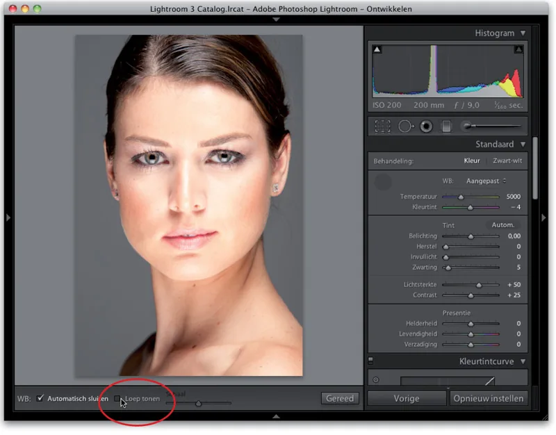
Before moving on, a word about the large pixelated grid that appears when you use the White Balance Selector tool. It is intended to magnify the area beneath the pointer, making it easier to find a gray area. I think the grid only gets in the way.
If it slowly drives you crazy—as it does me—clear the Show Loupe checkbox on the toolbar. (Because I think you will want this checkbox fairly quickly, I circled it in the image.) You will then have only the eyedropper (see step seven), without that annoying pixel magnification.
(If you happen to be one of the few people who find this grid useful, replace the word ‘annoying’ with ‘useful.’)
Step Nine:
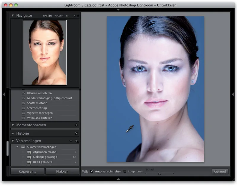
I am not a fan of that ‘useful’ pixel loupe, but something else works wonderfully with the White Balance Selector tool: the Navigator panel among the panels on the left. It is brilliant how it gives you a live preview as you move the White Balance Selector over different parts of a photo.
This is excellent and saves many clicks and a lot of time when you are searching for a good white balance. Set white balance to Auto and move the White Balance Selector over the background.
The Navigator panel shows what the white balance would look like if you clicked there. Not bad, right? You can, of course, click repeatedly with the tool to test different white-balance settings, but it is much faster when you only need to watch the Navigator panel.
Step Ten:
There are a few more things you should know about white balance. (1) When you have finished using the tool, click the spot where you picked it up—the round, dark-gray circle in the Basic panel—or click Done on the toolbar.
(2) If you select the Auto Dismiss checkbox on the toolbar, the tool returns to its home in the Basic panel after one click. I always keep this enabled, so I do not have to put the tool back before clicking in another area.
(3) The As Shot option in the White Balance (WB) drop-down menu restores the original As Shot white balance. (4) If you are in the Library module and need the White Balance tool, press W. This switches to the Develop module and immediately places the tool in your hand.