The use of color is an important part of every photographic composition. Alongside shape, lines, texture, and space, color is one of art’s key design elements. Photography is an art form, and color plays an enormously important role in developing your own style and creating the right mood when telling a story through photographs. It can, however, make or break an image.
We sometimes forget that subtle shifts in color can affect the mood and our perception of a shot, or that brilliant colors can send a powerful subconscious message about what we see.
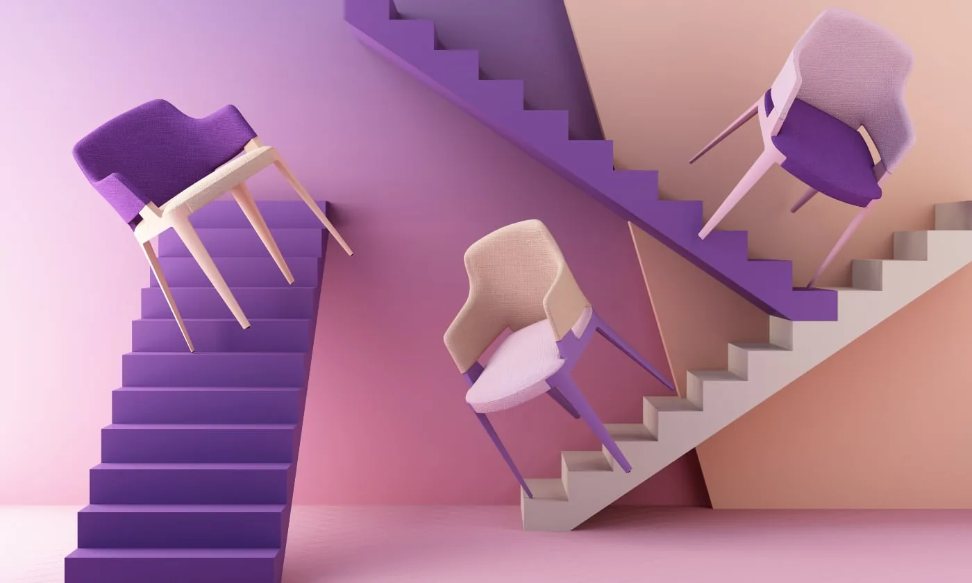
A bright color in the background, for example, can distract attention from the subject you want to photograph. Our eyes are drawn to certain colors, and those colors shape the feeling we take from the image.
Would you like to improve the use of color in your compositions? Are you wondering how to make certain photographs stand out even more? Here are three tips for using color in photographic compositions.
1. Learn more about color
When you are just starting to take photographs and create compositions, finding the right light and understanding the feeling evoked by different colors can be very difficult. That is why it helps to begin by learning more about the colors around you.
Learning to use color in photography involves more than simply choosing one color over another. Once you learn how to use colors together, you can create truly striking images.
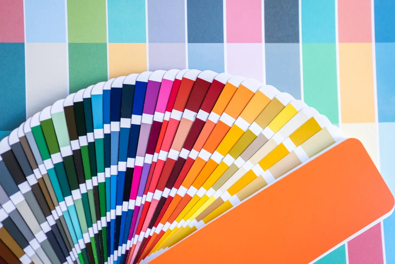
Start by exploring the color wheel, or look for contrasting or complementary colors in the world around you—for example, by approaching a simple task such as painting a wall in a different way.
When you are about to paint a wall, explore the different colors you can mix and consider how a particular color affects the mood of the room. This also says a great deal about the effect it can have in a photograph. The setting matters.
The color wheel is a useful tool when you are beginning to study the use and combination of colors. It makes it easy to see which colors reinforce each other and which do not. Red and green, for example, reinforce one another. Simply using the right colors can therefore help you create striking, vibrant photographs.
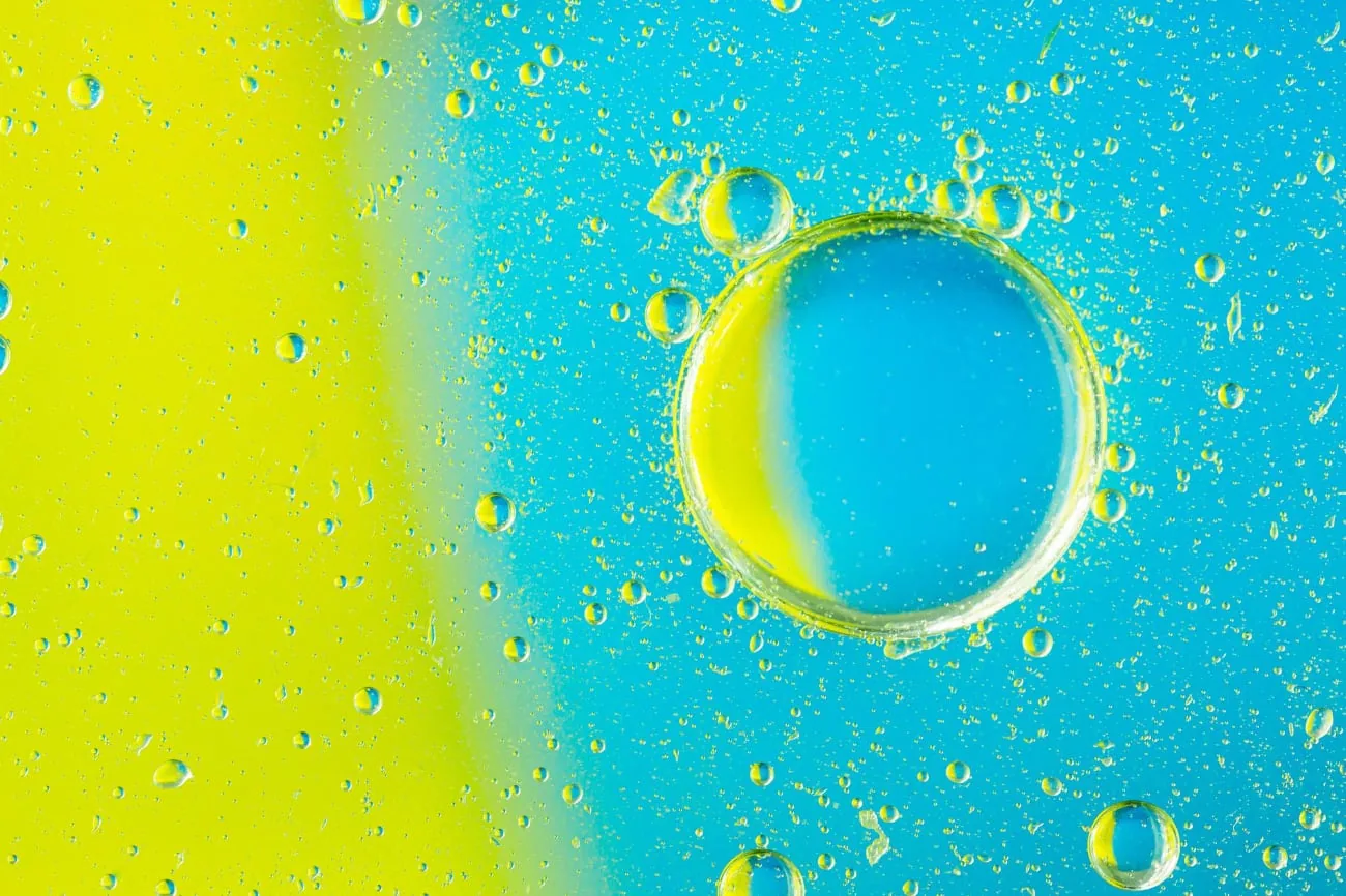
A yellow flower photographed against a blue background, for example, is pleasing to the eye because blue and yellow are complementary colors on opposite sides of the color wheel. You can use complementary colors in the foreground and background, in the subject and background, or across two or more subjects. Blue flowers photographed with yellow flowers can look just as striking as that yellow flower against the blue background.
Would you rather use color to make an image simpler and calmer? Read how minimalist color photography can help you use areas of color, space, and small accents.
Another way to use color is to choose analogous colors. These are colors that sit next to each other on the color wheel, such as blue and green, or red and purple. When using an analogous color scheme, try making one of the two colors the focal point of the image and use the second to enhance the overall composition.
A third approach is to focus on monochrome photographs. A monochrome image consists of different shades of a single color.
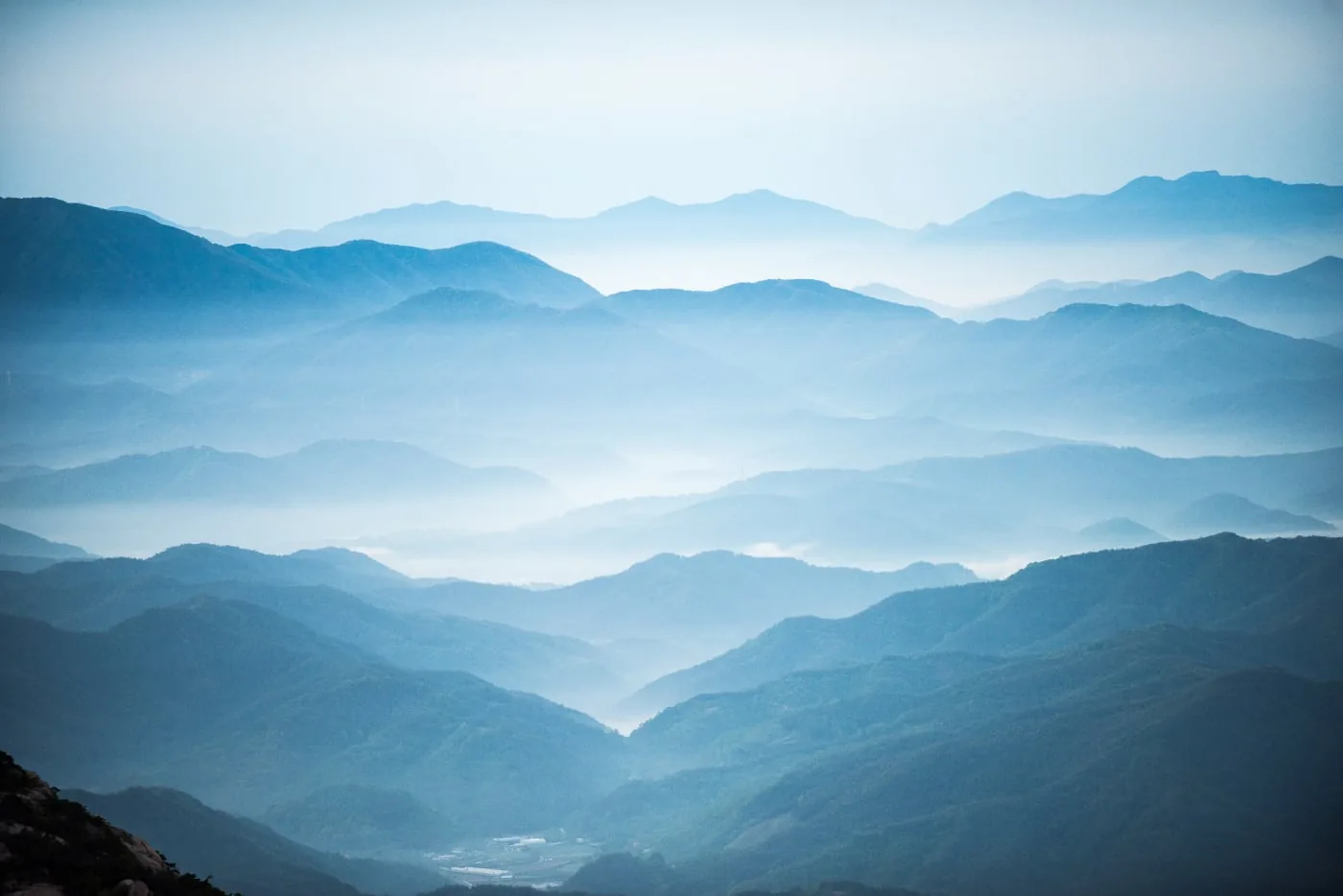
The key to a successful monochrome image is to find a scene with good contrast throughout: the photograph should contain a dark version of the color, a light one, and a good range of tones in between.
2. Which emotions do you want to convey?
There are many theories and ideas about how color affects mood, composition, and therefore photographs, but at the most basic level color can be divided into two very broad categories: cool and warm.
Did you know that certain colors not only attract our eyes, but also trigger a strong response in our brains? Some colors can evoke particular feelings, which is something to bear in mind when using color in your compositions.
When you want a photograph to evoke safety, peace, and calm, try to avoid red as much as possible. Red, on the other hand, is well suited to expressing intense emotions. Warm colors are more inviting; they evoke feelings of happiness, optimism, and excitement.

Do you want to paint a wall a particular color for a special photograph? Let the emotions you want to convey guide your choice of mixed paint color: red for more intense emotions, orange for warmth and happiness, yellow for cheerfulness, purple for spirituality, and so on.
3. Use natural color contrasts
Natural color contrasts are often the most beautiful, and color saturation is important here. Saturation refers to the richness of a color. An image with muted colors, such as a pale-green meadow on an overcast day, has very low color saturation. A field full of vivid orange pumpkins on a sunny morning, by contrast, has very high color saturation.
Saturation is one of the things you can adjust in post-processing if you are unhappy with how it looks in the original image.
Some cameras even let you adjust color saturation before you begin shooting, so you can decide in advance how rich you want the colors to be. If you think they need a boost, try changing your camera settings or adjust them afterward in Photoshop or another photo-editing program.
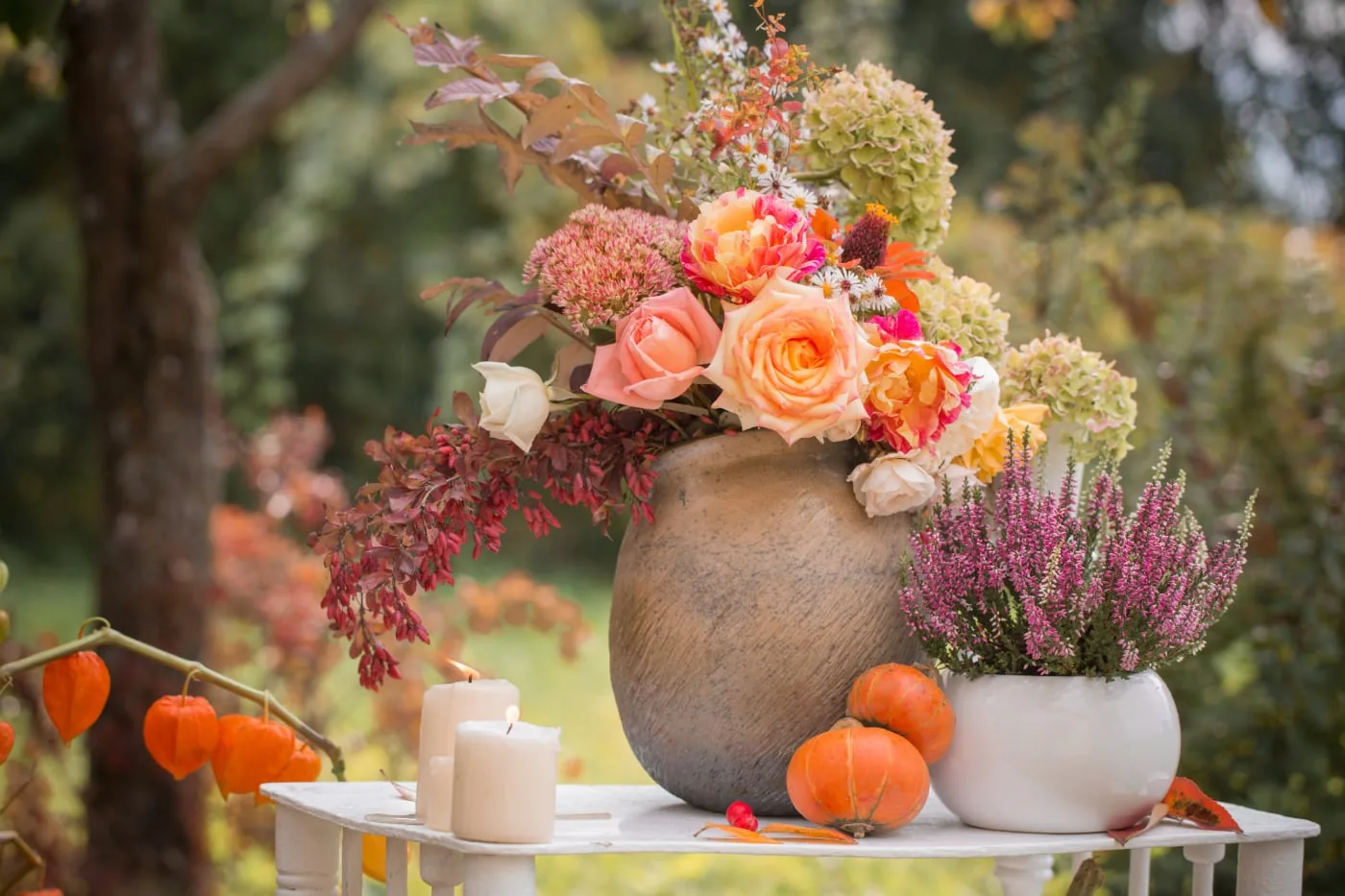
Both levels of saturation have value. An image with lower saturation looks softer, dreamier and more idealized. A highly saturated image looks bright and exciting. Consider the feeling the image needs to convey before deciding how much or how little saturation best suits the photograph.
The time of day can also add a particular color cast to an image and strongly influence how a shot is perceived. Photographs taken early in the day or late in the afternoon have a warmer appearance, making the scene feel inviting and cheerful. Photographs taken around midday or at dusk generally have a cooler effect, which can feel more relaxing and peaceful.
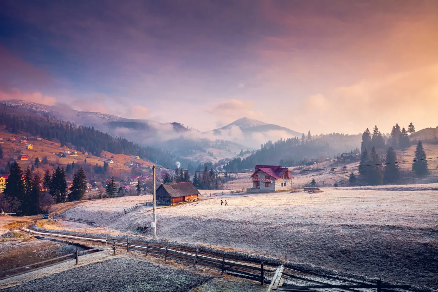
The most beautiful settings for a photograph cannot always be created. You can often find them outdoors in nature: perhaps the sun suddenly begins to set on a beautiful day and turns the sky golden yellow, or a dark blue sky makes the bright lights in a village stand out even more. Keep your eyes open when you are outside and look for natural color contrasts that can make photographs even more compelling. Another major advantage is that these images often need hardly any editing.